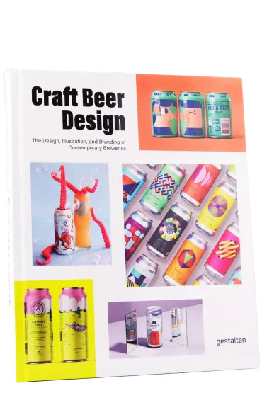
craft beer design
Notify me
Enter your email address here to be informed once as soon as the article is available again.
Over the last few decades, beer has undergone enormous development: the recipes have become more sophisticated, the flavor combinations more subtle, the raw materials more extravagant and the ideas and concepts more unconventional. But the change is not only in the bottles and cans, you can see it at first glance.
Craft beer has turned the beer market upside down in every respect and created a change in image that has a visual impact, among other things. Gone are the days when beers came with monotonous labels - today the shelves are colourful, loud, bold and stylish! Most craft breweries build a brand that comes with a good name, great beer, and a consistent design. And this design does not come from Aunt Erna, who likes to paint silk scarves in her free time, but often from graphic designers or artists. Currently we find illustrations, paintings, prints, ideas and colors on the labels in harmony with the creation behind. Form and function intertwine and the design acts as a complementary element.
Peter Monrad is someone who has dealt extensively with the contemporary art of beer. The Danish graphic designer has a soft spot for hopped creations and has combined his job with his passion: In the comprehensive illustrated book Craft Beer Design he put together a magnificent collection of the most impressive beer labels.
- Content
-
1 Stück
- Bierothek® ID
- 880000163
- EAN
- 9783967040326
- Weight
- 1kg(1kg with packaging)
- LMIV
- Responsible food business operator (EU)
- Beer region
- Deutschland
